
Moderna
Moderna · 2026
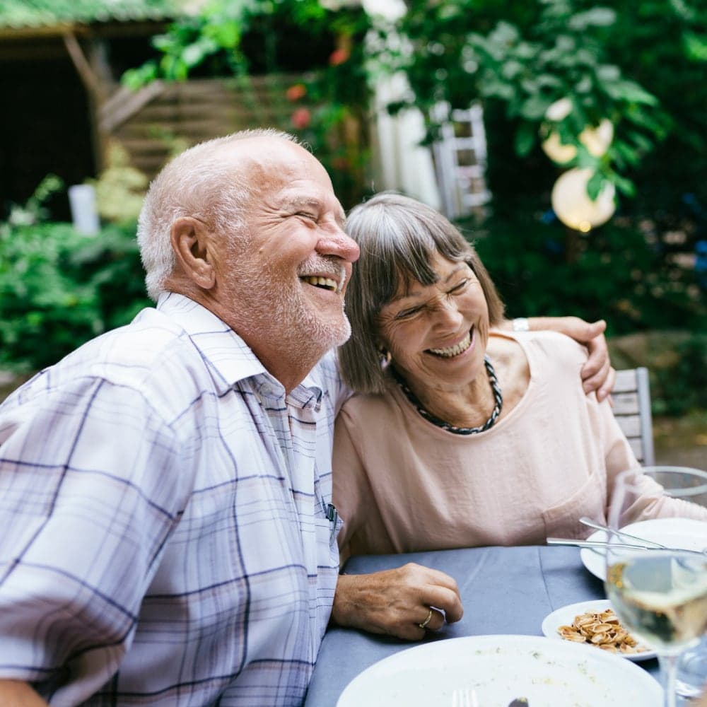
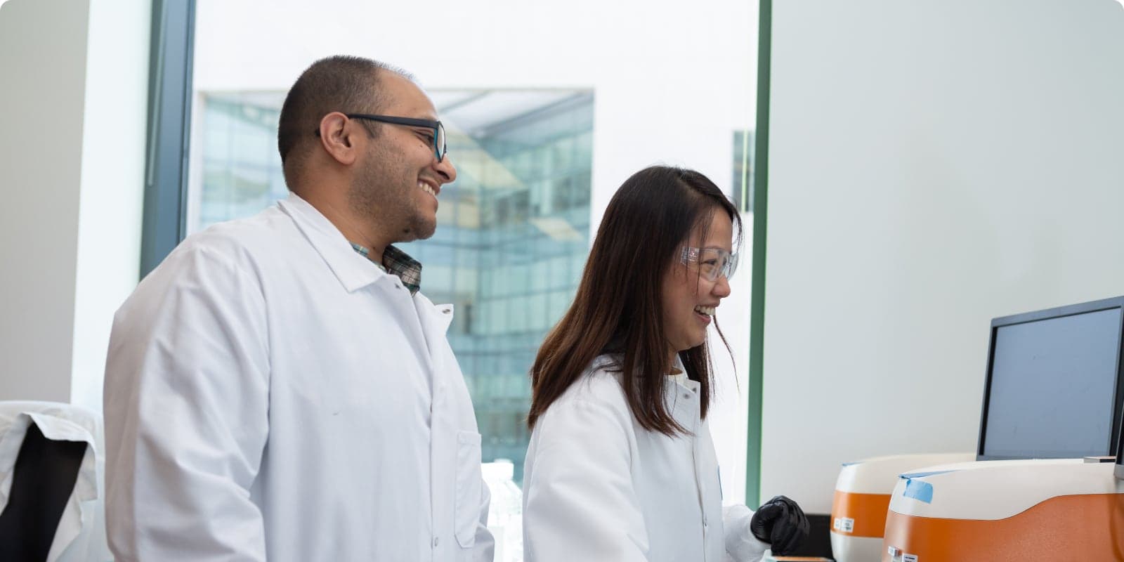
Moderna occupies a unique position in biotech — a company whose mRNA platform is genuinely world-changing, yet whose audience spans from research scientists to everyday patients. Their website must communicate cutting-edge molecular science with the same clarity and warmth as a consumer health brand. The design walks a razor-thin line between clinical authority and human accessibility. The challenge: can we capture a site that makes gene sequencing feel approachable without dumbing it down?

Science Meets Design
Moderna's typographic identity is built on Aeonik, a modern geometric sans-serif that carries scientific weight without the coldness of traditional clinical typefaces. Four font variants handle the full hierarchy — from bold hero statements about mRNA platforms to delicate caption text beneath pipeline diagrams — maintaining a sense of precision at every scale. The type is always tracked slightly open, a subtle signal of confidence that lets each word breathe.
The color palette is deliberately restrained: Moderna blue (#00A8E1) anchors the identity, used sparingly for CTAs and key data points against vast fields of white. Supporting grays stay cool and neutral, never warm — a choice that reinforces the laboratory-grade credibility the brand requires. There are no decorative gradients, no playful accent colors. The design earns trust through omission as much as inclusion.
What stands out is the SVG-heavy iconography — 34 inline SVGs representing everything from molecular structures to global distribution maps. These aren't decorative illustrations; they're functional diagrams that carry real scientific information. The generous whitespace between sections gives each piece of content room to register independently, creating a reading experience that feels more like a well-designed research paper than a corporate website.
Clean Architecture
Moderna's technical stack is refreshingly straightforward compared to the SaaS sites in our portfolio. Two CSS files, four font variants, and 10 images — that's the entire asset footprint. No WebGL canvases, no video hero sections, no JavaScript animation libraries. The restraint in the codebase mirrors the restraint in the design, and both serve the same purpose: clarity above all else.
The HTML structure follows suit — semantic, well-organized, with a clear section hierarchy that made DOM parsing predictable. The 34 inline SVGs were the most interesting extraction challenge, each one embedded directly in the markup rather than referenced as external files. Our pipeline extracted each as an individual asset while preserving their original inline rendering positions in the static rebuild.
This capture became one of the cleanest in our entire portfolio. Where sites like Ramp required navigating hundreds of network requests and multiple CDN domains, Moderna's simplicity meant near-perfect visual fidelity on the first pass. It's a reminder that great web design doesn't require technical complexity — and that the most challenging captures aren't always the heaviest ones, but the ones where every pixel of whitespace is intentional and must be preserved exactly.


A clean capture preserving Moderna's authoritative scientific aesthetic — Aeonik typography, clinical color palette, 34 inline SVGs, and a remarkably lean asset footprint that reflects the clarity of the design itself.
